COLOUR ME HAPPY
10th November 2021
Back in the 1930s famed architect Le Corbusier formulated a colour system to transform interiors, harness light and boost your mood… As winter draws in, here’s how to wield its powers. Words by Laura McCreddie-Doak.
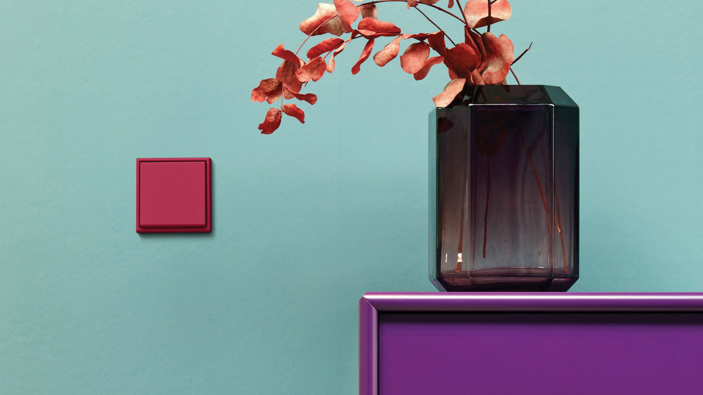
Pretty pastels, verdant greens, sunshine yellows – scan anyone’s interior design Pinterest boards recently and it looks like a rainbow was let loose with a paint brush. Forget muted tones and subtle accents, people are embracing wall-to-wall colour in an effort to add some joy to the homes we’ve been confined to for the past year. Playing with colour is hard. Get it right and you’ll have a space that makes your heart sing, the wrong combination and you’ll have a permanent headache. Which is where Le Corbusier’s Polychromie Architecturale can come in very handy.
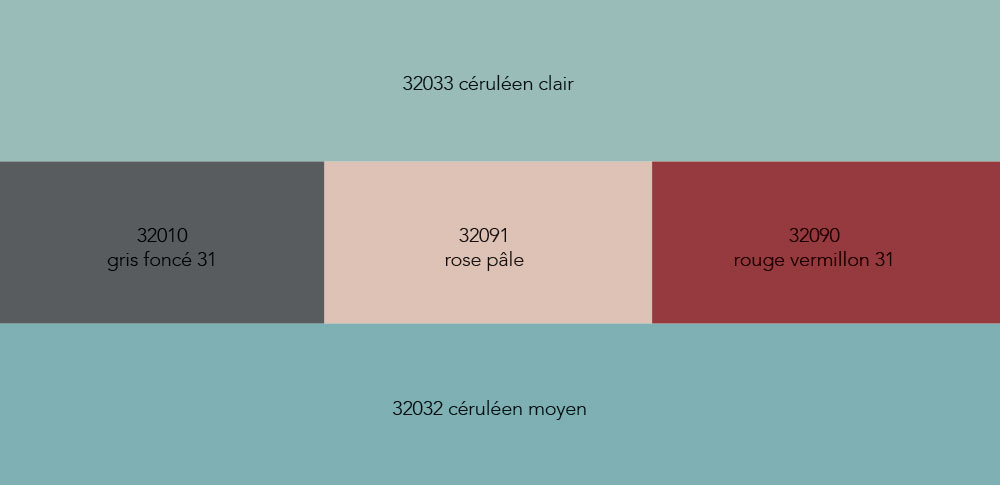
Created by renowned Swiss-French architect, designer, painter, urban planner, and father of modern architecture, Charles-Édouard Jeanneret (he adopted the pseudonym Le Corbusier in 1920), the Polychromie Architecturale comprises 63 shades that are naturally harmonious and which embody specific spatial and human effects. Used in dialogue with each other they can change how a space looks and how it makes people feel. The first palette was compiled in 1931 and features 43 shades that go from a pale peachy colour through to a sludgy grey via blues, greens, and pinks that range from vibrant to pastel. Le Corbusier also created separate colour keyboards, which he devised when he was contracted to work for Salubra, a Swiss wallpaper company in 1930. You can play with virtual ones on the Les Couleurs Le Corbusier website and they illustrate how the various shades can be used to atmospheric effect. The larger panels provide the background hues, while the smaller ones through the middle are there for accent inspiration. For example, the Sky keyboard has two larger panels of two blues – céruléen clair and céruléen moyen – while through the middle are options ranging from the winter-sky shade of gris to the magenta-esque rouge vermillion. The Scenery option pairs two lush greens with everything from the chocolate-y richness of terre sienna brûlée through to pretty rose pink. In 1959 20 other colours, more powerful and dynamic, were added to the existing ones. Le Corbusier designed an additional keyboard, this time with a single dominant colour under which were accents to play with.
The result is a suite of colours that all complement each other. It’s a perfect colour concept that allows for individual expression but without any risk of clashes. They can also be used to manipulate light and space. A long thin corridor-like kitchen with French doors can be made to look airy by gradating from dark shades to lighter as you get closer to the doors. An accent colour can create interesting divisions in rooms that appear too big or that have mixed uses. The only catch Les Couleurs Le Corbusier controls who is allowed to use these precise shades in paints. Currently that privilege is afford only to Swiss brand Kabe Farben. Which is where trusty B&Q and Feldspar come in. Choose your palette, take it to your nearest B&Q where they can create your custom colours, and chanel your inner interior designer. Pinterest will be all the prettier for it.

CONTINUE READING
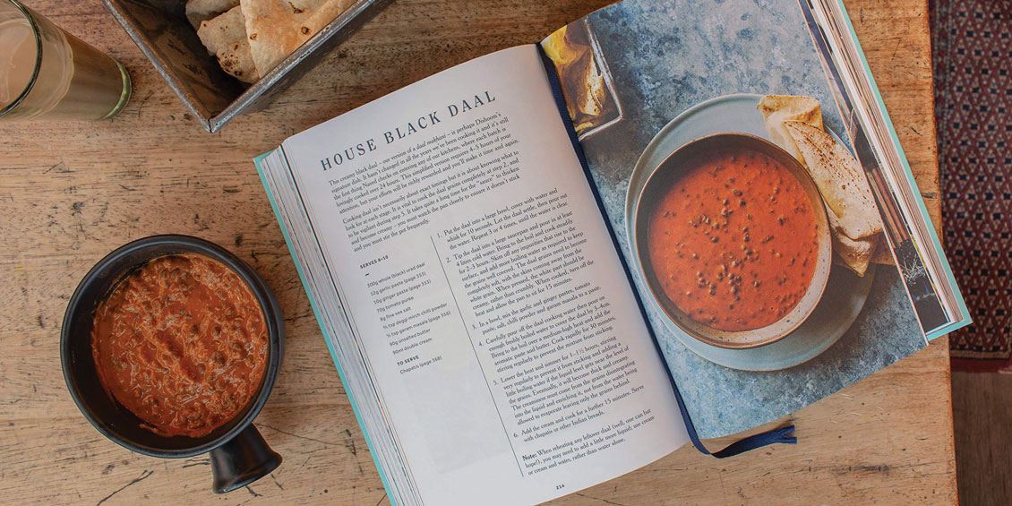
DINNER PLANS | A BRACE OF JOYOUS PLATES
From India to Thailand, with two feet on British soil respectively, here’s a pair of square meals from two ex-pat masters of their cuisine.
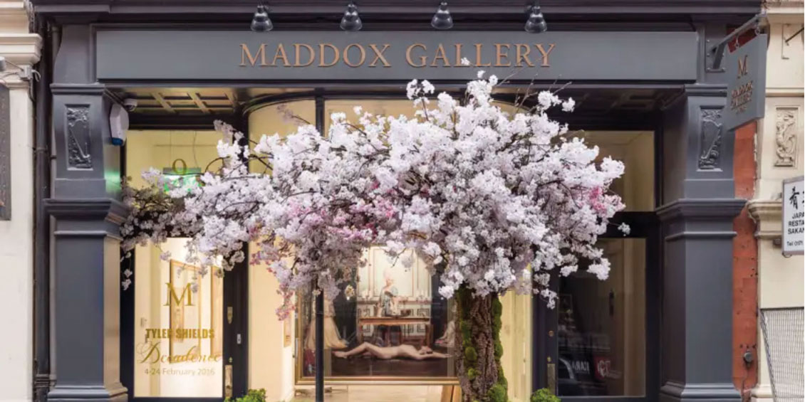
ART ATTACK
We catch up with Maddox Gallery CEO John Russo to get the lowdown on how their disruptive approach is taking the art world by storm.
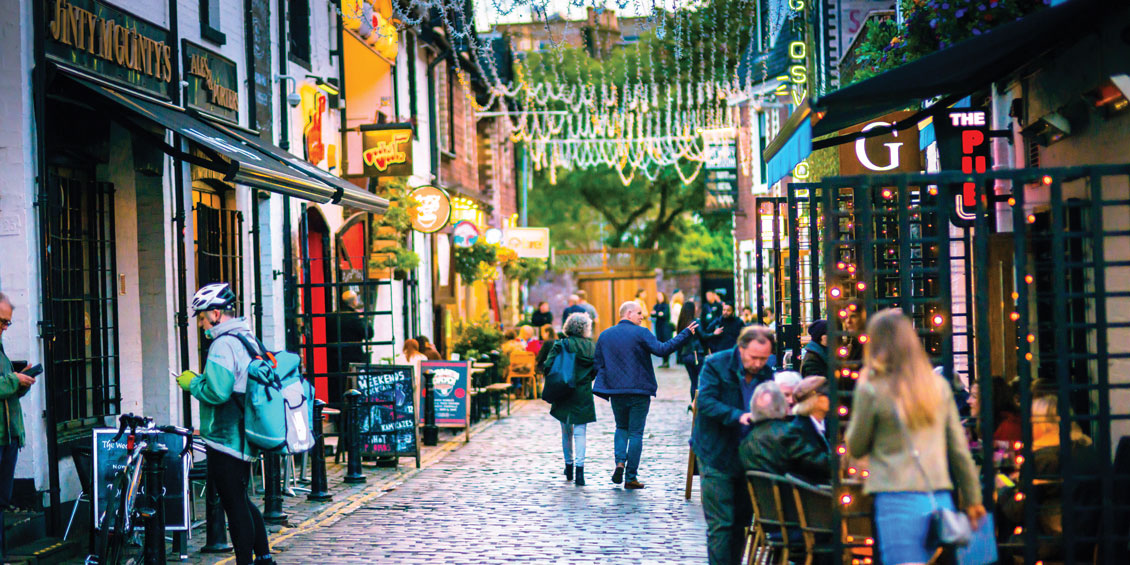
BONNY ON CLYDE
Every discerning globetrotter’s bible has called it: Glasgow is officially the UK’s best city break destination.